Activity for Jamf Now
No one should have to understand system debugging messages to figure out what is happening to their company devices.
See study
No one should have to understand system debugging messages to figure out what is happening to their company devices.
Jamf Now is a cloud-based SaaS mobile device management (MDM) platform, empowering small businesses that use Apple products. More than 500,000 devices are configured and managed through Jamf Now.
Our mission was to build and ship the easiest and best MDM for organizations that may not have IT experience on staff.
As Jamf Now's functionality and integrations scaled, so did the number of time-sensitive tasks that could arise. Our existing alerting system was no longer cutting it.
Growing organizations also needed a way to audit how their devices were being managed. What our industry had to offer proved lacking and confusing.
As the Product Designer for Jamf Now, all user-facing workflows, features, interactions, UX roadmaps and strategies were my responsibility. I co-lead this project with Jamf Now's Engineering Architect.
UX Research interviewed and tested concepts with experts representing enterprise and small business IT and Information Security. Requirements were regularly discussed with Product Managers and Owners from Jamf Now and Jamf Protect, representatives from the five Engineering teams, and our UI engineers.
I worked with all groups to gather information, iterate, and share designs. I also met at least once weekly with the project team.
The goals above were generated after discovery, but we started with company leadership telling us internal and market problems that we needed to solve. They came down to two key points:
Jamf Now has a global messaging system that alerts users of critical issues. It appears at the top of the viewport and cannot be dismissed until the issue is resolved.

However, users are presented just one issue at a time. They may not be aware that there may be other simultaneous issues to fix until the current one is resolved. We agreed that this banner needs to find a replacement solution as a part of our outcomes.
Experts from Jamf and Jamf's user community walked us through examples of the logs they relied on. We were told that even industry leaders found them difficult. What we saw resembled debugging messaging arranged on tables with timestamps.
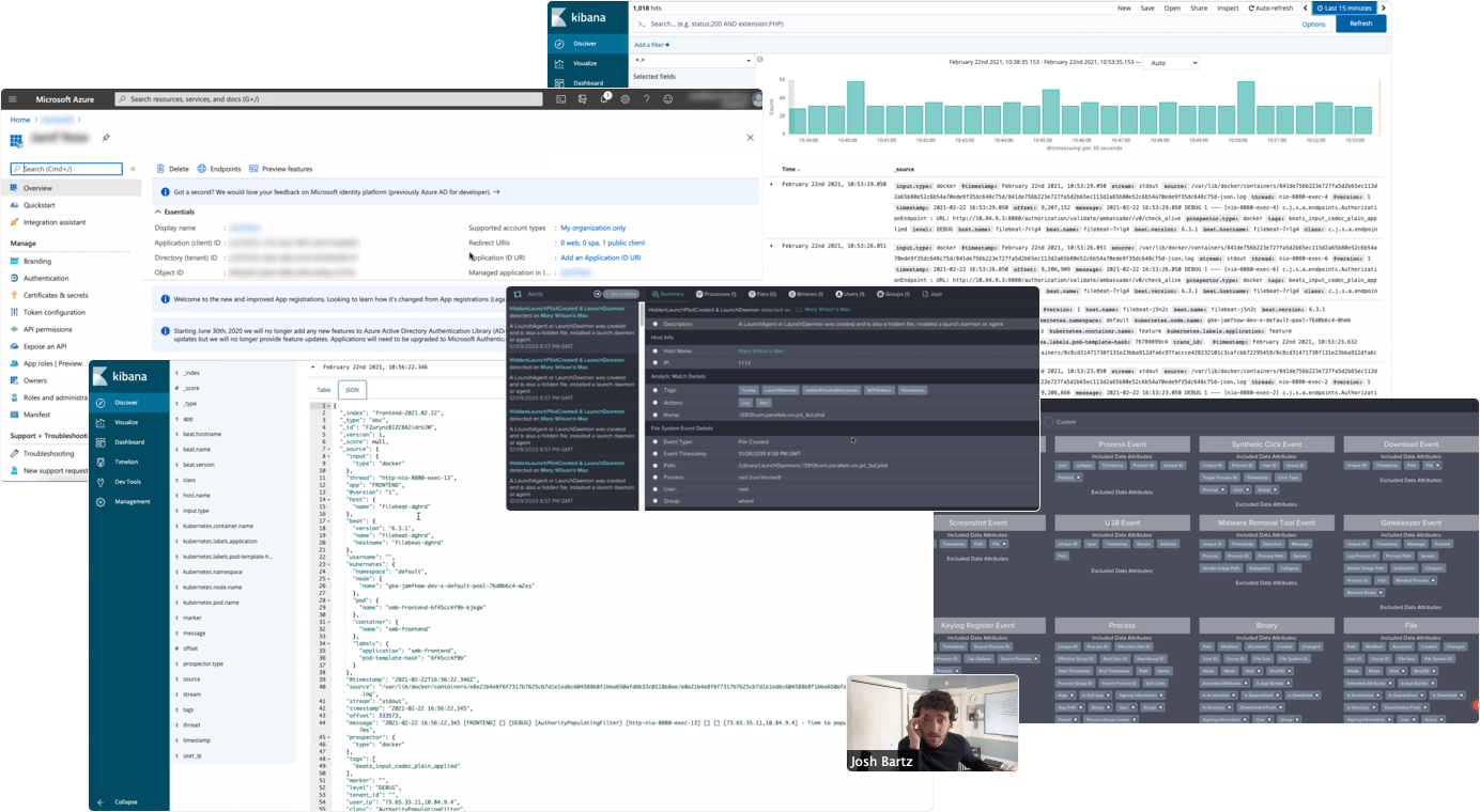
On previous projects, our research showed us that our primary users were people who volunteered to manage their company's devices, not IT professionals. Backend server messaging would not be well received.
Our project group abandoned Enterprise examples and looked at other industries. We realized that consumer platforms with social components, like Spotify, took a much simpler approach.
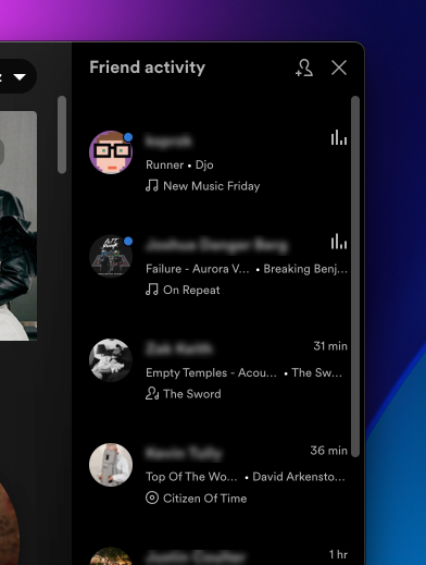
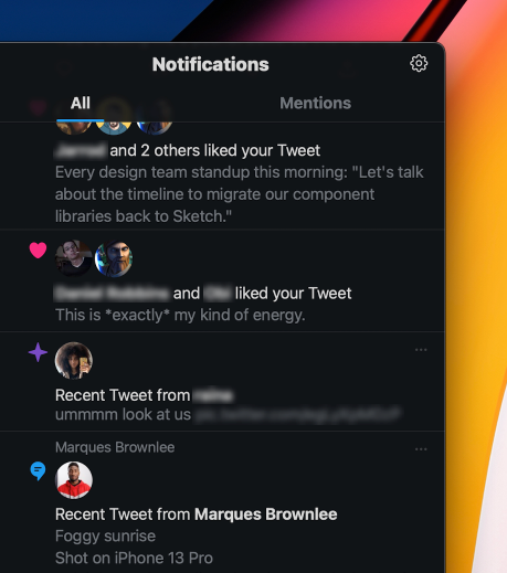
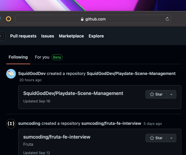
We look at audit logs all the time. You do, too. Every Internet user on the planet is already trained to understand them. These logs just hide under different monikers: Activity, Notifications, Following, etc. With a list of must-have features and ideas, I went to work on a concept to take out for research.
After rounds of feedback and iteration, my concept put the focus on which user or integration performed what action. We came up with true-to-product messaging using plain human language.
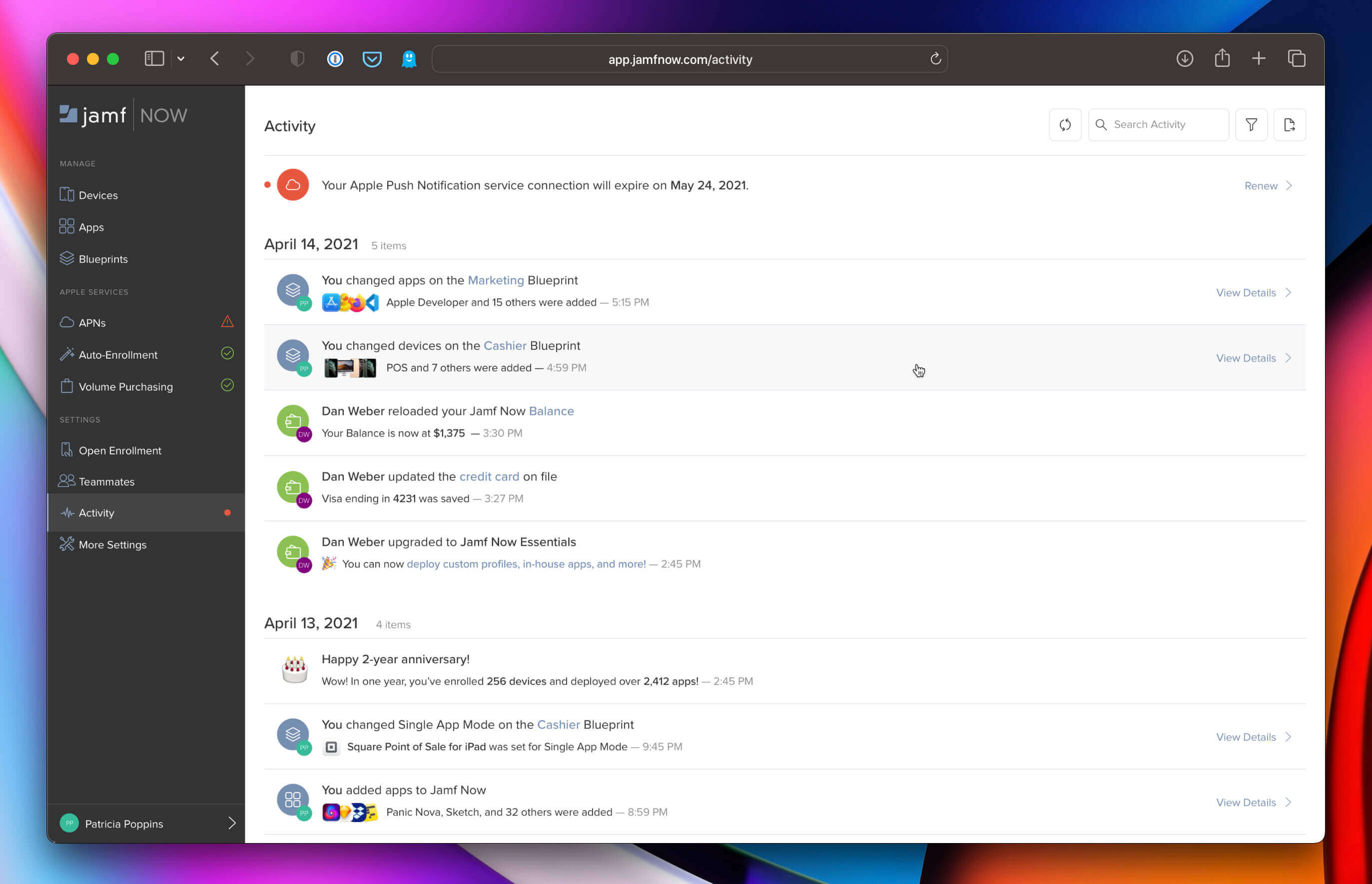
Administrators can view who made changes to their deployed devices, system and billing settings, warnings for upcoming certificate expirations, or depleted software licenses, and stay informed of malware alerts from Jamf Protect (if deployed). Each message offered in-line links and calls to action to review the objects changed.
A series of user interviews and internal presentations not only validated the ideas, but added to them. Users and stakeholders alike felt that this direction was usable and familiar.


"It's welcoming because it looks familiar."(quote from a concept research interview)
Messaging about product anniversaries, subscription tier changes, and notices relevant only to the current user (such as account changes) improved the confidence they had with the product.
These messages are pinned permanently at the top of the list. Once resolved, an entry appears in the logs below to keep a record of when the issue was resolved, who resolved it, and pertinent details about the action.
Users told us that they needed something more powerful for Activity than the existing Search and Filter interface. I designed a panel that can be toggled open that offers new date range and text input filters to meet the need.
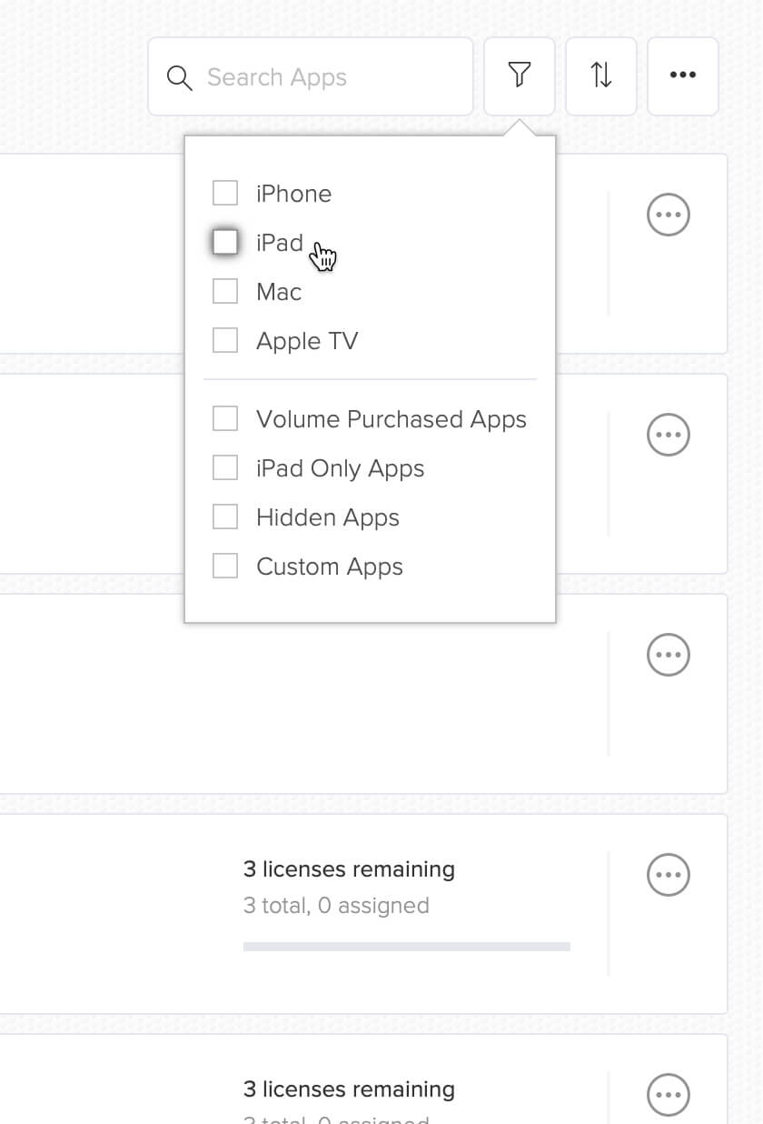
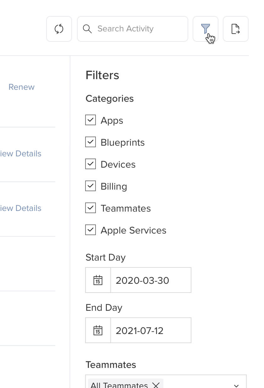
Jamf Now believed that improving components and patterns platform-wide keeps tech and design debt low. I worked with Product Owners to make sure this new panel would become the new Filter pattern across the platform.
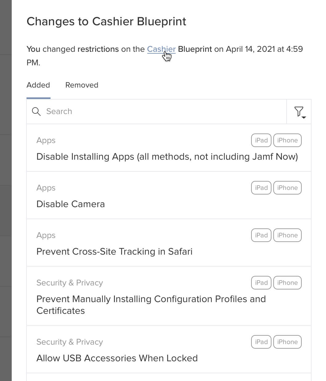
By clicking "View Details," users can see the devices, settings, and Blueprints changed in a right-hand drawer without leaving the page. In-line links and clickable items allow them to follow changes to their source.
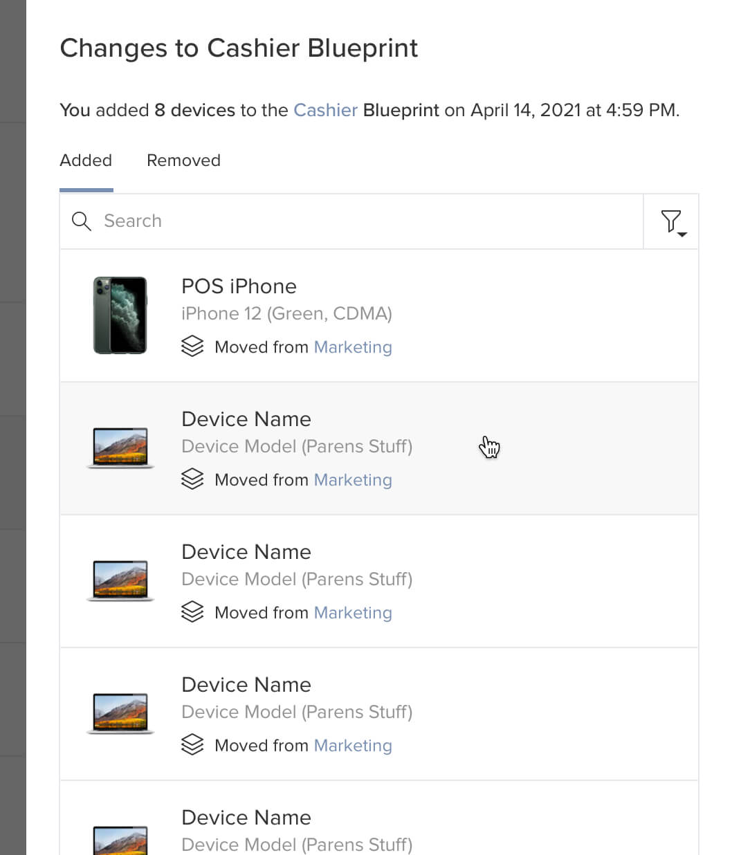
In-line Search and Filter, a platform-wide improvement from a previos project, gives users the power to sort and minimize scrolling.
"As a non-IT person, it is nice to use something that is easily digestible in terms of consuming information."(quote from another concept research interview)
Finally, we gave administrators the option to export these human-parsible logs, or the unprocessed original data.

A button on the top of the table opens a modal that presents these options. Then a downloadable CSV is generated, including only the entries filtered.
From discovery to handoff, this project took roughly five months. Documentation was extensive.
Along with workflows and mockups, I documented all services, integrations, and users that are capable of performing tasks that automatically generate an entry, a list of every kind of change that should be considered for messaging, and a list of all objects, services, and integrations that can be affected by those changes. I also created a table of message templates in Mad Libs format.
I gave walkthroughs of my documentation for Engineering, Product, and User Experience leadership to insure that we had included all of our work. We also amended it with notes on opportunities and other considerations for us to revisit for future iterations.
This project was my pride and joy for Jamf. It summed up years of work and advocacy for a better way to include everyone involved in the build process. Regular communication and collaboration brought out our best ideas, and more importantly, we delivered work that proved that both users and the business can have their needs met.

The most important takeaway, however, is an artifact demonstrating a product design leader's true expression when it sinks in that he's got his work cut out for him.
Special thanks to Craig Gieselman, Molly Rowan, Alex O'Neal, Jen Seipel, and Michael Cullen-Benson for proofreading, QA testing, and providing feedback on this case study. Image backgrounds from Apple.